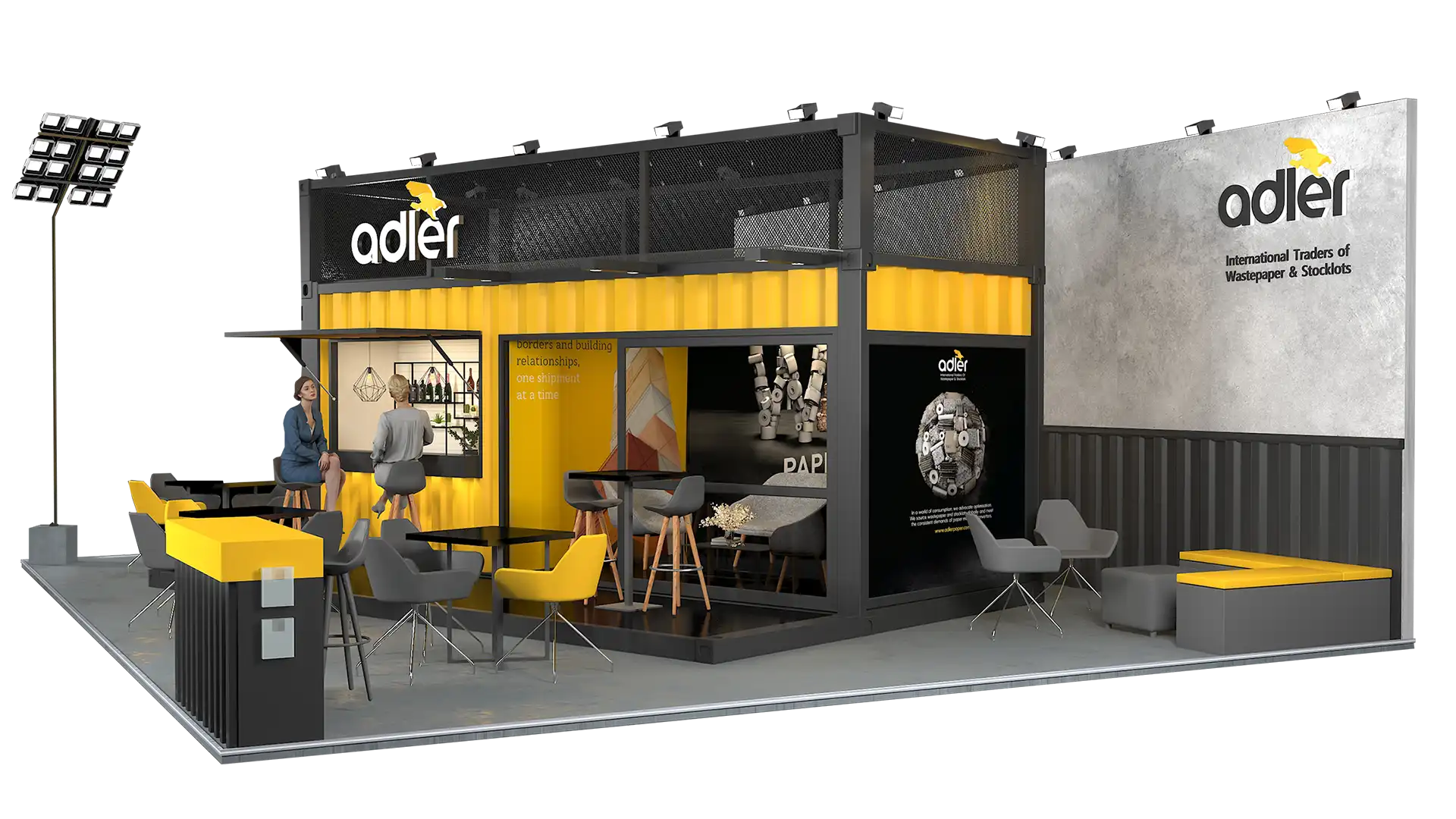
Story Cafe
rebranding from
‘just scrap’ to ‘serious power.’


Adler had spent years being the quiet, dependable recycling brand everyone knew, but nobody noticed. Reliable, yes. Memorable, no. The founders wanted out of that shadow. They wanted authority, presence, and a brand that didn’t whisper… but walked in like it owned the entire yard.
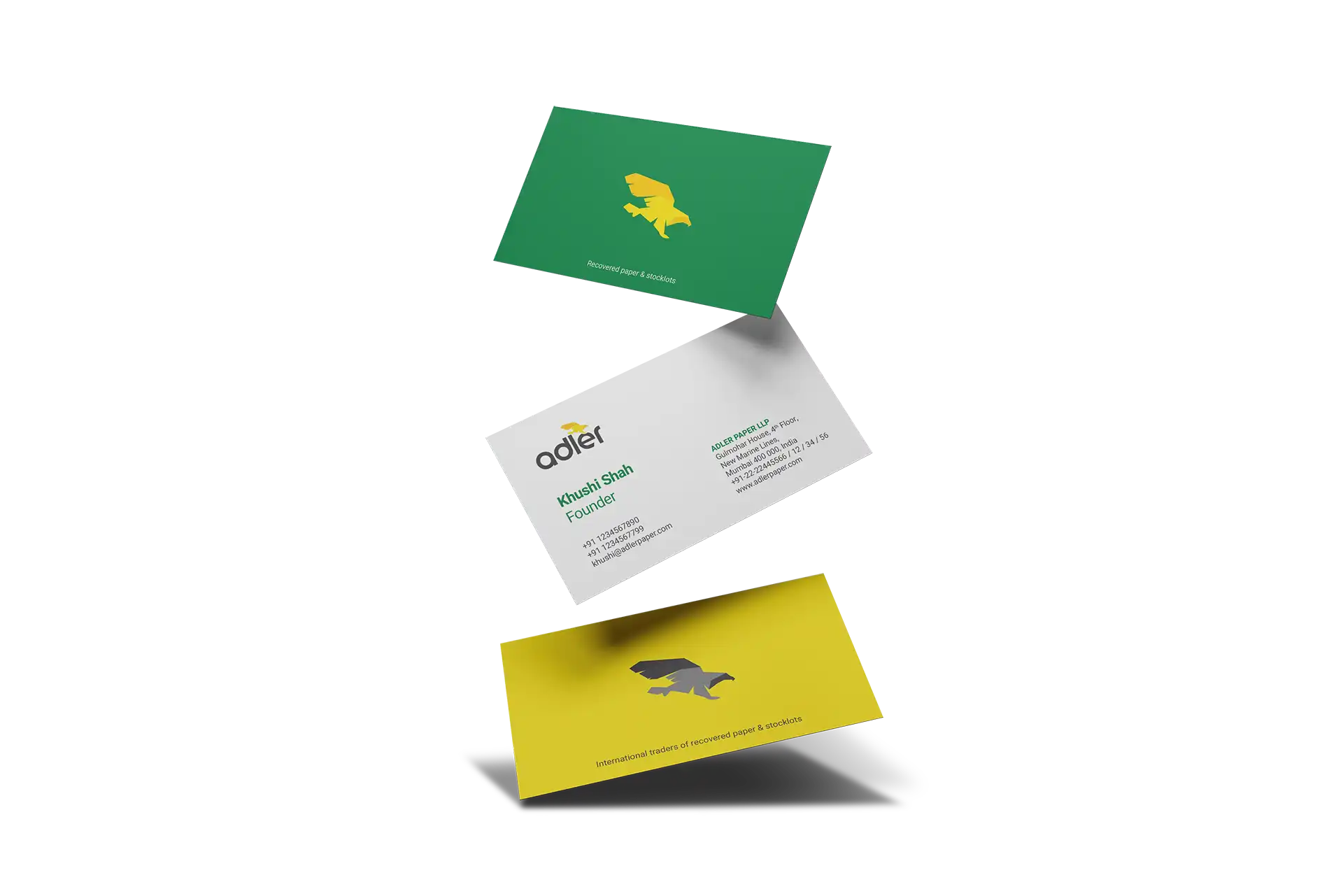
So we stripped away the old identity and rebuilt Adler from ground zero, with purpose, power and a lot of attitude that it owns for sustainability.
When a brand decides to get bold, there’s always that lingering fear that consumers might look at it and go, “Umm… why are you suddenly dressed like a superhero when yesterday you looked like a warehouse?” But that’s exactly why this worked.
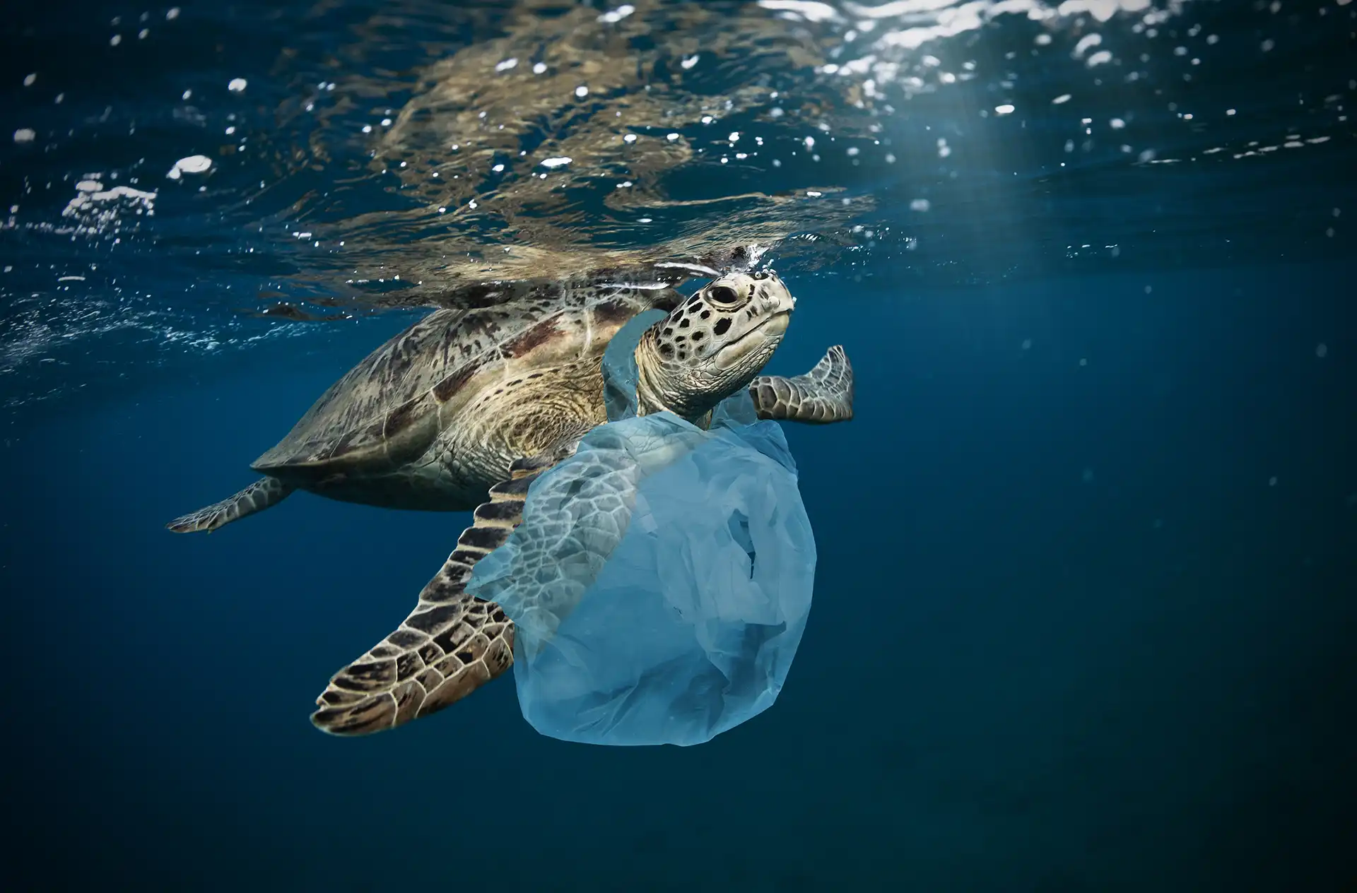
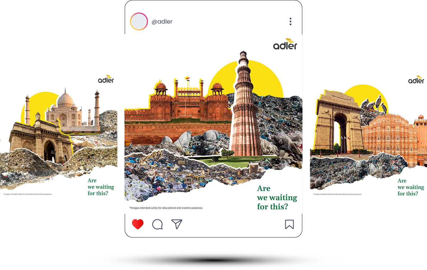
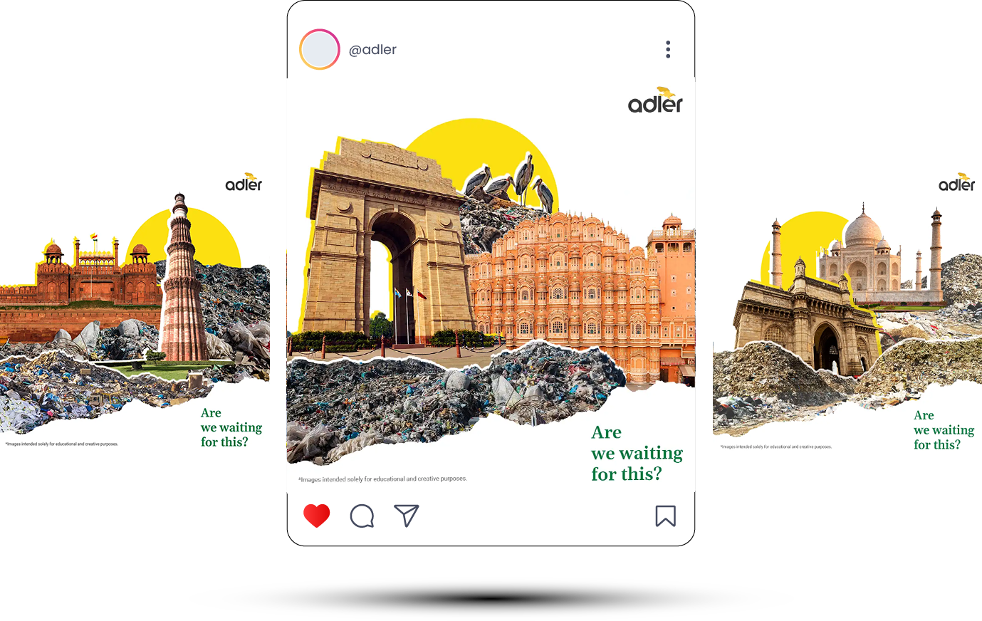
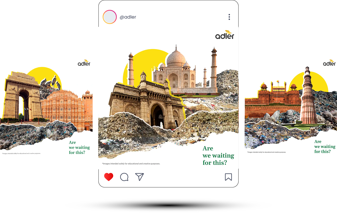
Recycling in India has stayed stuck in the same visual template for decades and we took this as an opportunity to break this entire pattern with a brand look that makes recycling look smarter, need of hour.


The twist of being bold? Half the crowd won’t get it. The other half will LOVE it. And that second half is enough to change the category.
Recycling in India has always looked predictable, so we asked: What if recycling didn’t look recycled? What if it looked powerful? What if a wastepaper trader looked like a global captain of change? That “what if” became the foundation of the entire rebranding direction.
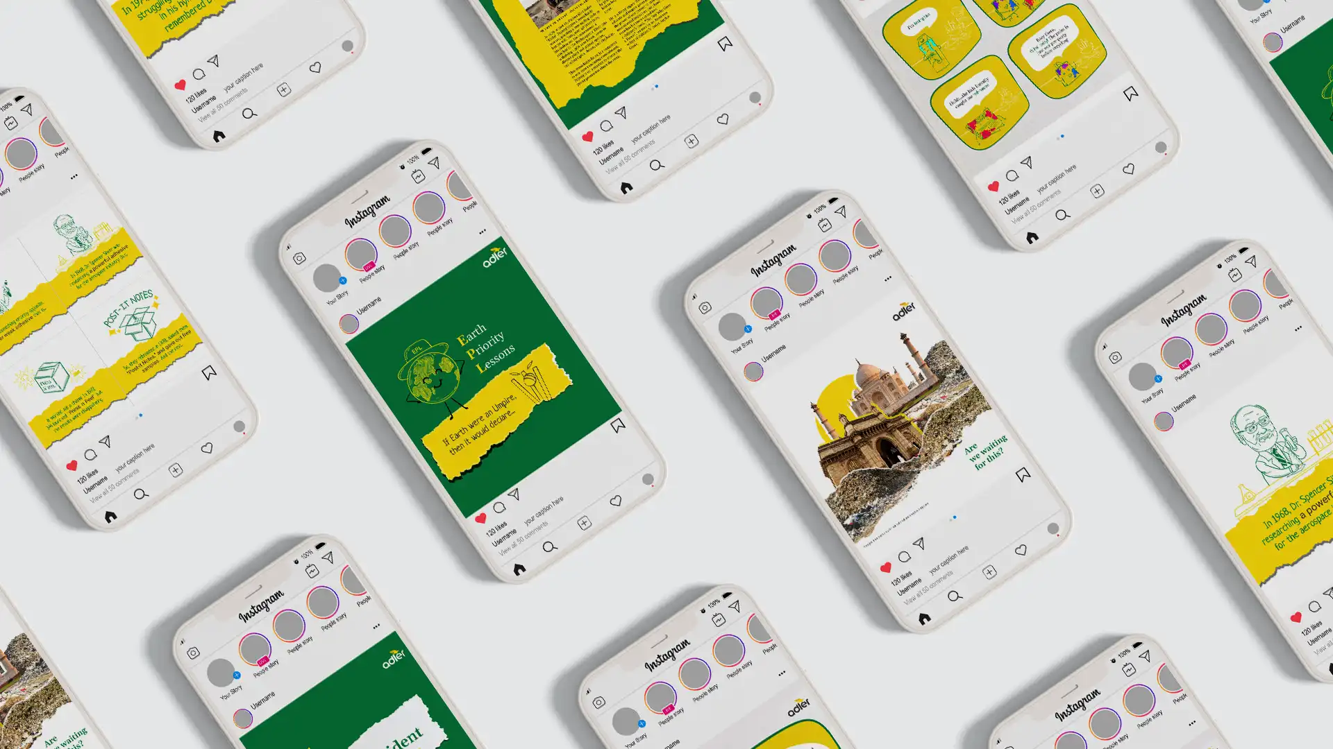
The launch needed energy, movement, and emotion. A brand film was the perfect way to bring that to life. It introduced Adler 2.0, not just a new logo, but a refreshed brand personality that inspires belief and drives impact.
We have two rules:
Rule #1: Never lose any media to chance.
Rule #2: Never forget Rule #1.
So we went beyond the digital footprint and into print. Magazines, newspaper ads, everywhere the world still pays serious attention.
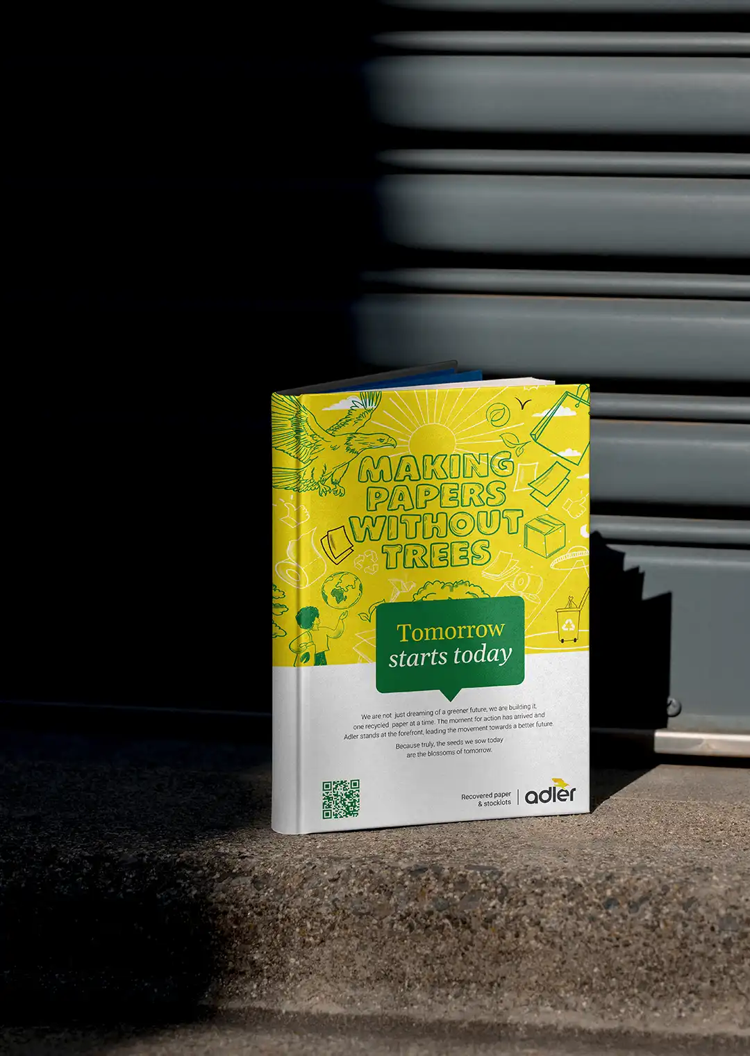
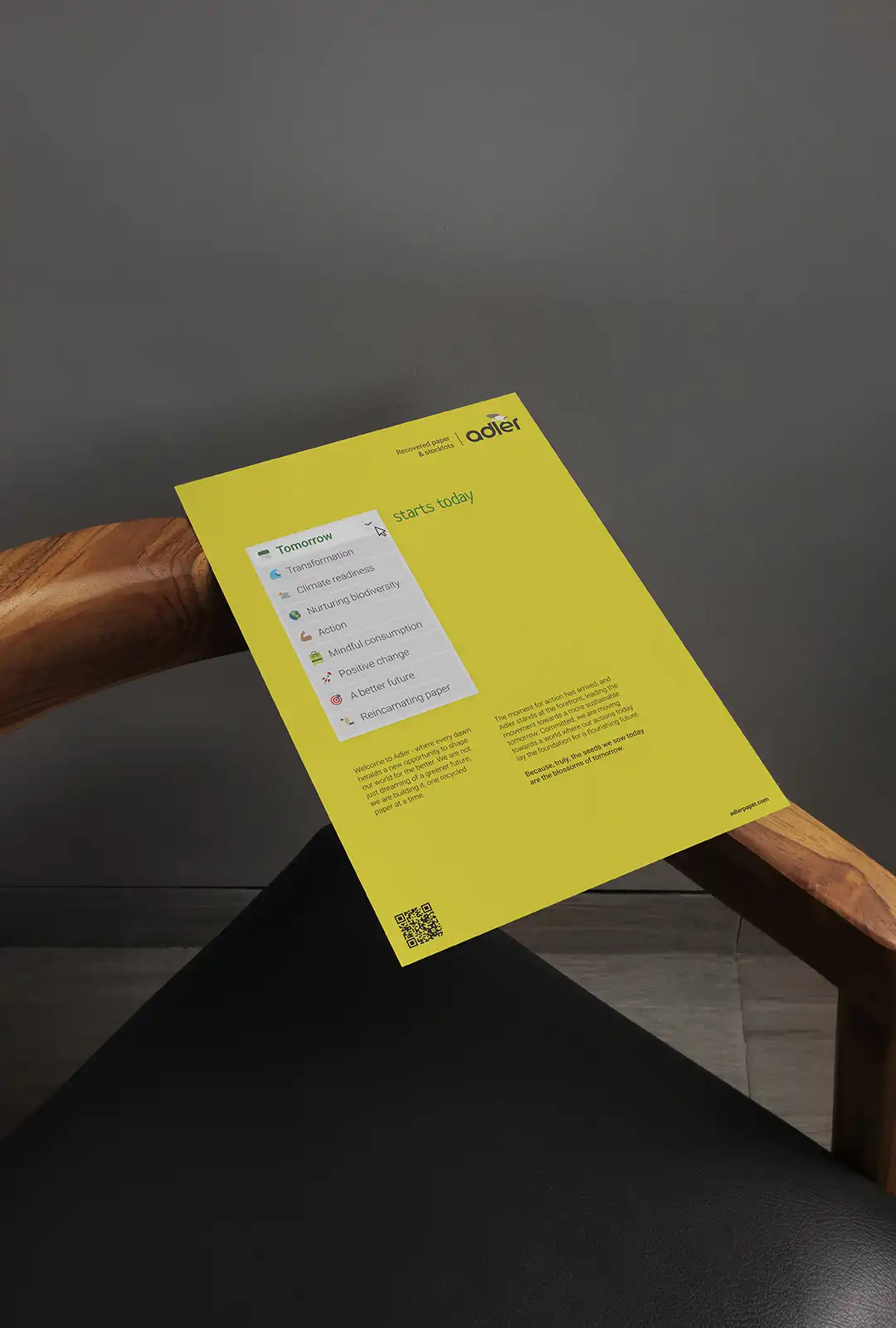
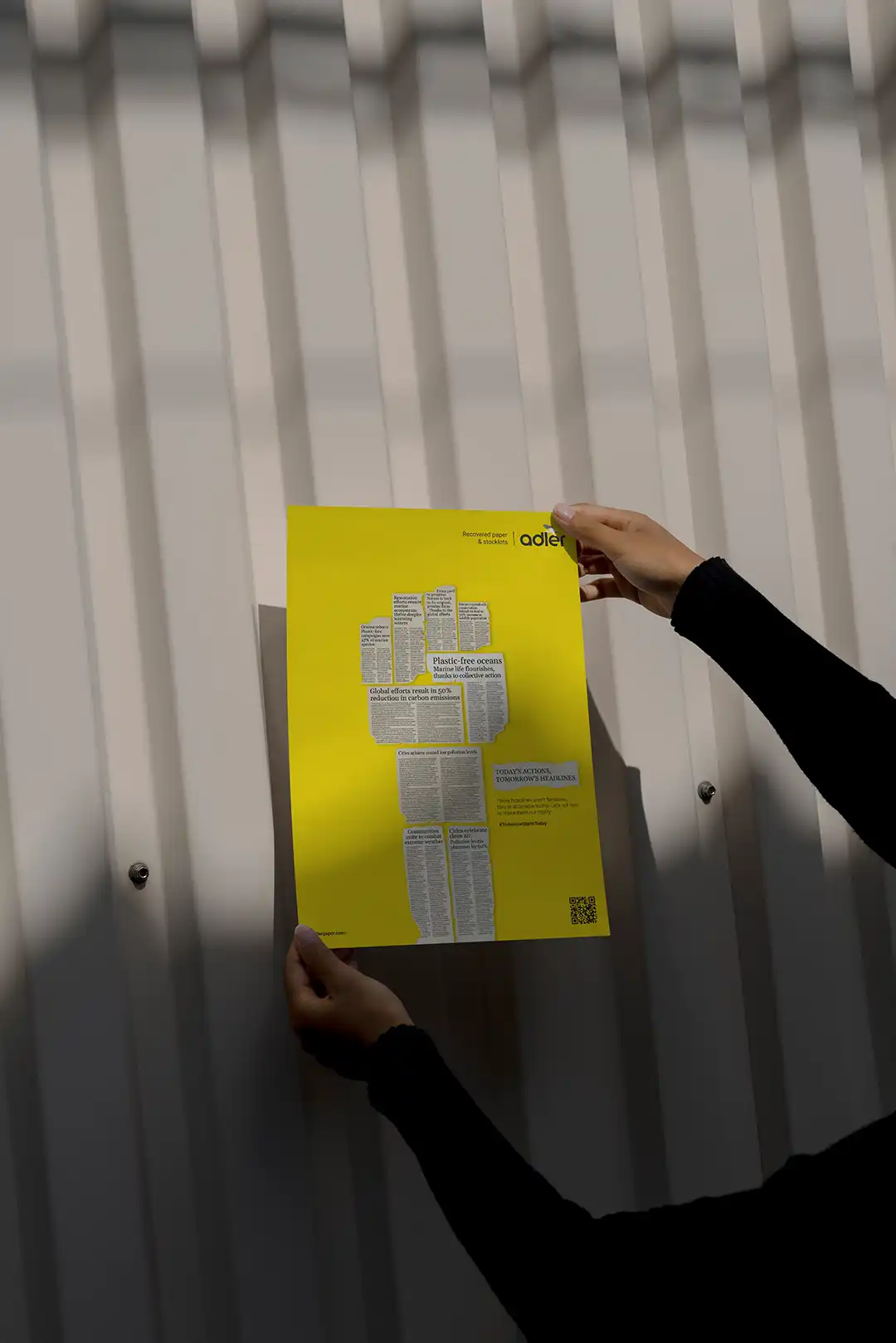
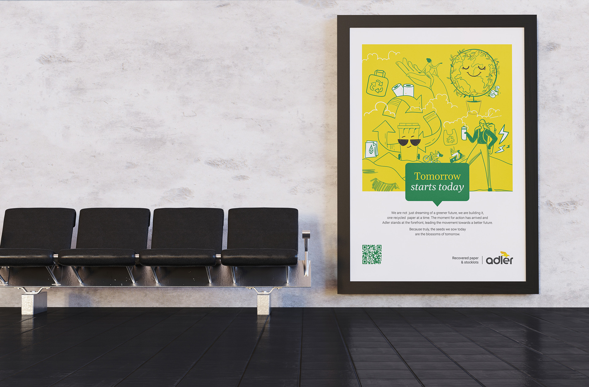
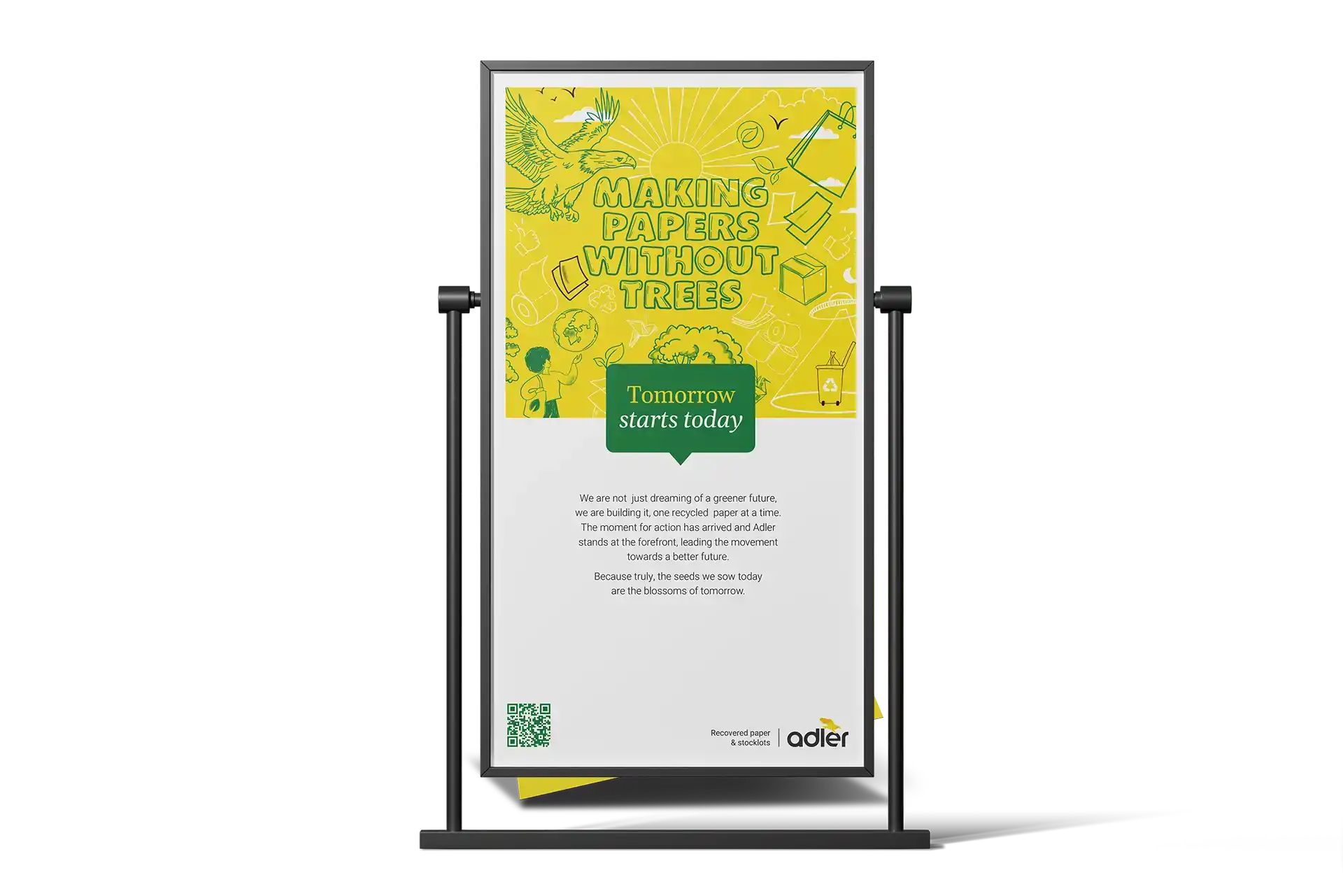
Adler now speaks like a captain of change rather than a player in the middle of the pack. The communication sounds confident, assertive, and future-facing & instantly positions Adler as the company people look at to understand where recycling is headed, not where it has been stuck for years.
We didn’t just update how the brand looks. We updated how the brand thinks. And the world now sees it the same way.